20081126

Personal Piece


For a loved one. Watercolor is a nice break from all the vectors.

20081015

20080925

Snakes & Earrings Book Jacket


ILL3 Project. Had a lot of fun with this piece. It only helped that I loved the book.

20080806

Summer Semester Is Over


And i have a lot of new work to show... but I still have a lot of past works to upload.

Utada Hikaru is arguably one of the best-selling, most successful Japanese artists of all time. She was born in NYC and is in fluent in both English and Japanese. At only 25 years of age, the singer-songwriter-producer-arranger has already released 5 full-length Japanese albums and is working on her 3rd full-length English right now (under UTADA, her family name). Her sound is eclectic yet her vocal arrangements and harmonies are completely her own.

She is both an inspiration and all-time favorite so it was important that I do this visual recreation of her album Ultra Blue correctly and with style. Of the work I've done so far, this is definitely one of my personal favorites.

PS. the obnoxious banners & copyright stuff will come down when the Orphan Works Act is no longer a threat to all artists/creative persons. To anybody that fits this criteria or simply appreciates the fact that artists help elevate over-all social experience then please educate yourself on the Orphan Works Act. I am in the process of doing so and will be posting again on it some time soon.

20080513

Tell A Friend, Tell A Foe!


My portfolio site is up! I've got quite a bit of work to do in terms of adding galleries and fine-tuning html settings, but I'm very pleased with it so far. I know that this little link-graphic-thing I've created is the same BG pic as the header for this blog so expect a reworking of the blog sometime soon.

And if you don't have the latest version of flash then it will prompt you to download it.

Enjoy! (click the picture for the link)

20080416

Spring Show Is Coming.


And this is not going in it but I'm fairly proud of it nonetheless.

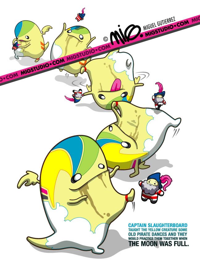
We were given a small piece of text to create a one page illlustration from for my first project in Children's Storybook Illustration. I took the moon out because it seemed unnecessary and, though I like how advertisement-worthy the type treatment is, I agree that I can make it a little bit more friendly/not as tense.

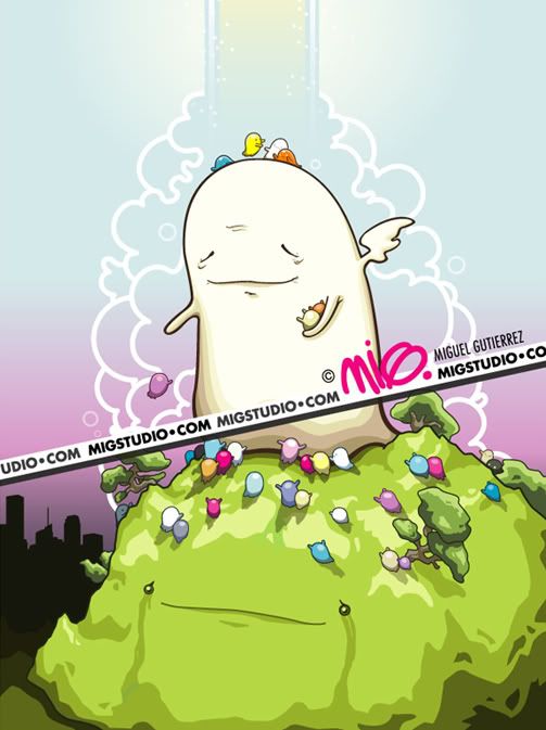
In all honesty, first reaction was to draw this Captain Hook guy on a ship, looking over the sea to a yellow serpentine monster much bigger and scarier than him. Oh, and throw a moon in the background.

But how much fun would that be? And would I give that boring & non-stimulating book to my kid?

No. Because children are just like little men and women: they too deserve to be entertained, confused, forced to think, bombarded with design, and sometimes even be scared by the unfamilar.

I'm not saying that this is the piece that is going to define my career. But anytime I can finish a piece and say I truly accomplished what the tecnhnical aspects asked for and maintaned my own sense of artistic integrity and need to offer something new... that's really what it's all about.

20080315

The Nokia Morph Concept


I'm a little bit late on this, but whatever. Nokia, in conjunction with Cambridge University, has released their design concept for the New Nokia Morph, which uses advanced nanotechnology in a way that I'm not even sure I fully comprehend yet. Basically you can pull, morph and fold this phone into various devices including a headset, notepad, bluetooth ear attachment, and even a bracelet that matches whatever texture you want, without ever damaging it (it's virtually dirt-proof). It may be a long time before something like this is even affordable to the average consumer but it's promising nonetheless.

Watch the concept video here. The type, music & color schemes are a little off the mark (this would probably have looked more amazing around 2000-2002) but still, the concept is outrageous.


Thanks to Christian for this
Source: Gizmodo

20080308

Graphic, Bold & Beautiful.


This video, even from my youth to now, has had such an influence on what I view as proper aesthetics. It's bright, fresh, graphic, and so climactic. At the end of the song, when it quickly progresses to that really high note is just.... exactly what everything should be. So clean.

20080306

The One & Only Namie Amuro


This is definitely not the first nor last time I post this promo piece of Namie Amuro that I did last semester in ILL3. This was my first time doing a finished illustration in Adobe Illustrator (ever) and I couldn't have picked a better design or person to spend 20+ hours obsessing over.

Here are some great promo pictures from her upcoming "60s 70s 80s" release on 3/12


20080219

Hillside Ghosts


This was originally a piece i did in ILL3 as an edtorial, but I'd rather not state an exact theme of it. I find that (as challenging and rewarding as working with concept can be), most pieces of art are only as interesting as the amount of interpretation you leave up to the viewer. So do what you do, art-connoisseur.

20080210

A Quick Break from My Real Homework.


Just some quick rendering on a few sketches I composited into one. Obviously no concept here other than I really like design & drawing pretty girls. Ask anybody who's known me since kindergarten: drawing girls will never get old for me.

And pay no mind to the type. I know it's hideous (I just wanted something fun).

20080206

Why People Pay $$$ for Great Design.


Magnetic Curtain design by Florian Kräutli.

Not only is this curtain functional but it's completely original in its design.

Effective industrial designers remain some of the most respected artists because, not only do they have to understand great design and concept, but, additionally, they have to make things completely functional & execute them effectively in a huge variety of tangible/durable materials. It's more responsibility than i'd like to imagine but, when its done right, is very deserving of the big paychecks.

Source: Apartment Therapy

20080205